v1.0 Naming
One of the features we are working towards in the 1.0 release, is a simplified way of adding, setting & getting widgets.
Each widget will have a single function that supports all three actions.
If you combine this with the context manager feature, this becomes possible:
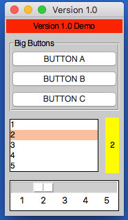
from appJar import gui

def press(btnName):
    app.popUp("INFO", "You pressed " + btnName)

def update(value):
    if value == "list": app.slider("slider", app.listbox(value)[0])
    elif value == "slider": app.listbox("list", app.slider(value))
    app.label("display", app.listbox("list")[0])

with gui("Version 1.0", bg="teal") as app:
    app.label("Version 1.0 Demo", colspan=2, bg="red")
    with app.labelFrame("Big Buttons", colspan=2, sticky="news", expand="both"):
        app.button("BUTTON A", press)
        app.button("BUTTON B", press)
        app.button("BUTTON C", press)
    app.listbox("list", [1, 2, 3, 4, 5], rows=5, selected=0, submit=update)
    app.label("display", "1", row=2, column=1, bg="yellow", sticky="news")
    app.slider("slider", colspan=2, range=(1,5), change=update, interval=1)
Operation
As demonstrated above, each widget now has a single function - the name of the widget.
Call this function passing one or both of the key parameters, to determine what should happen:
app.label("title", "text")      # ADD a label if the title is new
app.label("title", "text_2")    # SET a label if the title already exists
print(app.label("title"))       # GET a label if no widget is being added or set
Key Parameters
The two key parameters are:
| Parameter | Data type | Description |
|---|---|---|
| title | string | A unique identifier for that widget type. |
| value | string | Any relevant information for the widget. |
The logic is as follows:
- If
titledoesn't exist - ADD the widget, using thevalue, ortitleif novalueis specified. - If
titlealready exists and avalueis specified - SET the widget (either the values or state). - If
titlealready exists and avalueis not specified - GET the widget.
Positional Parameters
When adding a widget, it is positioned in the first column of a new row.
If you want to change this, you can specify where it should go, either by naming the paramters:
app.label("title", "text", row=2, column=4, rowspan=3) # ADD a label
Or by passing them as a tuple:
app.label("Main Title", pos=(1, 0))     # ADD a label in row 1, column 0
app.label("Sub Title", pos=(2, 0, 2))   # ADD a label in row 2, column 0, spanning 2 columns
| Parameter | Data type | Default | Description |
|---|---|---|---|
| row | integer | <next row> | The grid row to place the widget in. |
| column | integer | 0 | The grid column to place the widget in. |
| rowspan | integer | 1 | The number of grid rows to stretch the widget across. |
| colspan | integer | 1 | The number of grid columns to stretch the widget across. |
| pos | list/tuple | () | Position parameters for the widget, in the order: row, column, colspan, rowspan |
GUI Parameters
There are two GUI parameters which affect how widgets are displayed sticky and stretch.
These can be modified when adding a widget, just bear in mind they are GUI settings, and will affect all future widgets in the current container.
app.label("Title", sticky="", stretch="none")
app.label("SubTitle", sticky="ns", stretch="row")
| Parameter | Data type | Default | Description |
|---|---|---|---|
| sticky | string | <varies> | Describes which sides the widget will stick to, one or more of: n, e, w, s in a single string. |
| stretch | string | <varies> | Describes how the widget will stretch to fill the row/column: none, row, column or all. |
Event Parameters
Most of the widgets also have some support for events (see the events page for more information).
submit & change will pass the name of the widget to the function, drop will pass the data to the function:
NB. the parameter should only be the name of the function, don't include any brackets.
def update(name):
    if name == "size":
        updateSize()
    elif name == "toppings":
        updateToppings()

app.listbox("size", ["small", "medium", "large"], change=update)
app.listbox("toppings", ["corn", "cheese", "peppers"], change=update)
app.image("img1", "placeholder.gif", drop=True)
| Parameter | Data type | Default | Description |
|---|---|---|---|
| change | function | None | A function to call when the widget is changed. |
| callFunction | boolean | True | Set this to False, when setting the widget to stop the change function form being called. |
| submit | function | None | A function to call when the widget is submitted. |
| over | function (list) | None | A function to call when the mouse enters the widget, with an optional second function to call when the mouse leaves. |
| drop | boolean/function | None | Update the widget with dropped data if True, otherwise call the function. |
| drag | function (list) | None | A function to call call when the widget is dragged, with an optional second function to call when the widget is dropped. |
Other Parameters
There are some other parameter that can be set on widgets.
| Parameter | Data type | Default | Description |
|---|---|---|---|
| label | boolean/string | False | Adds a Label before the widget (only some input widgets), either the label's title or the the text of this parameter. |
| right | string | None | Specify a premade right-click menu to link to the widget. |
| font | integer/dict | None | Pass either a font size, or a dictionary of font properties to use for this widget's font. |
| focus | boolean | False | Give keyboard focus to the widget. |
| tip | string | None | Sets text to show in a mouse-over tooltip. |
Label
A widget for displaying text in the GUI.
.label(title, value=None)
Thevaluewill be the text to show in the label.
Labels can receive asubmitparameter, making them clickable.
Labels can receive adropparameter, allowing them to receive drop events.
| Parameter | Data type | Default | Description |
|---|---|---|---|
| kind | string | standard |
Set to selectable or flash to add different kinds of labels. |
Message
A widget for displaying multi-line text in the GUI.
Will automatically wrap the text, based on either the aspect or width settings, defaulting to 50% wider than tall.
.message(title, value=None)
Thevaluewill be the text to show in the message.
Messages can receive adropparameter, allowing them to receive drop events.
| Parameter | Data type | Default | Description |
|---|---|---|---|
| aspect | integer | 150 | Set the ratio between the width & height. |
| width | integer | None | Set the number of characters per line. If None, then the aspect is used to calculate the width. |
Entry
An interactive widget, for capturing user input in the GUI.
.entry(title, value=None)
Avalueis not required, but if provided will populate the entry.
Entries can receive achangeparameter, and can link asubmitparameter to pressing.
Entries can receive adropparameter, allowing them to receive drop events.
Entries can receive alabelparameter - boolean to use the label's title or text to display.
| Parameter | Data type | Default | Description |
|---|---|---|---|
| kind | string | standard |
One of: standard, open, save, directory, numeric, auto or validation. |
| secret | boolean | False | Configures the entry box to show stars instead of characters. |
| default | string | None | Sets default text to display in an empty entry. |
| rows | integer | 10 | If the kind is auto this will set the number of rows to show. |
| labBg | string | None | Special parameter to change the BG of the validation label in a validaiton entry. |
| text | string | None | Special parameter to change the text of the file entry button. |
There are also some validation settings that can be applied:
| Parameter | Data type | Default | Description |
|---|---|---|---|
| limit | integer | None | Sets a maximum limit on the number of characters that can be entered. |
| case | string | None | Set to upper to force uppercase or lower to force lowercase. |
Text
An interactive widget, for capturing multi-line user input in the GUI.
.text(title, value=None)
Avalueis not required, but if provided will populate the text.
Text boxes can receive achangeparameter.
Text boxes can receive adropparameter, allowing them to receive drop events.
| Parameter | Data type | Default | Description |
|---|---|---|---|
| scroll | boolean | False | Will configure this as a scrollable text area. |
| tags | list | [] | A list of tags, where each tag contains a name and dictionary of values. |
| end | boolean | True | Whether to add the new text to the end (True) or beginning (False) |
| replace | boolean | False | Will replace any existing text in the text area when updating. |
Button
A clickable button for triggering events.
.button(title, value=None)
Thevalueshould be a function to call when the button is pressed.
| Parameter | Data type | Default | Description |
|---|---|---|---|
| image | string | None | A path to an image to show in the button. |
| icon | string | None | The name of an icon to show in the button. |
| label | string | None | Alternative text to display on the button. |
Link
A clickable hyperlink to trigger events or launch webpages.
.link(title, value=None)
Thevaluecan be set to a function to call when the link is clicked, or a valid URL to open in a browser.
Check
A checkbox style widget, that can be checked/unchecked.
.check(title, value=None)
Thevalueshould be True or False, indicating if the check starts selected or not.
Check boxes can receive achangeparameter.
Radio
Radio buttons are used in groups, only one of them can be checked.
By default, the first radio button added to a group will be selected.
.radio(title, name=None)
Thetitleis the radio button's group.
Thenameis the text to display next to this radio button.
Radio buttons can receive achangeparameter, it will be linked to all radio buttons of the sametitle.
| Parameter | Data type | Default | Description |
|---|---|---|---|
| kind | string | standard |
Set this to square to change the style of the radio buttons.Not supported in ttk or on Mac. |
| selected | boolean | False | Should this radio be selected? |
Option
When clicked, displays a drop-down of items, one of which can be selected.
Setting this widget won't change the values, but change which one is selected.
.option(title, value=None)
When adding, thevalueshould contain a list of items to display in the drop-down.
When setting, thevalueshould contain the item to select, unless a differetnmodeis set.
Options can receive achangeparameter.
Options can receive alabelparameter - boolean to use the label's title or text to display.
| Parameter | Data type | Default | Description |
|---|---|---|---|
| kind | string | standard |
Set this to ticks if you want tickable options. |
| selected | string/integer | None | Start with the specified item/position selected. |
| disabled | string | - | Sets the character used to indicate disabled menu options. |
| checked | boolean | True | When setting the widget, this determines what to do to the specified value. None will delete the value. |
| mode | string | select |
One of: select, change, rename. clear or delete - see below. |
Different modes can be used when setting the widget:
select - the default, the specified value will be selected.
clear - deselects all items in the option box.
change - the contents of the list will be replaced with a new listi, with an optional index.
rename - this will change the text of an item in the option box, to the newName.
* delete - this will delete the specified option from the option box.
Spin
Shows a single value, with arrows to scroll up or down, allowing the user to change the value.
Setting this widget won't change the values, but change which one is selected.
.spin(title, value=None, endValue=None)
If only thevalueis set, it should be a list of values to display in the spin box.
IfendValueis also set, then both parameters should be integers, and appJar will generate a range of whole numbers between the two values.
When setting, thevaluewill be selected.
Spin boxes can receive achangeparameter.
Spin boxes can receive alabelparameter - boolean to use the label's title or text to display.
| Parameter | Data type | Default | Description |
|---|---|---|---|
| endValue | integer | None | If specified, value & endValue should be integers, and will be used to generate a range. |
| selected | integer | 0 | The position of an item to select. |
| item | string | None | The name of an item to select. |
Listbox
Displays a list of items, one (or more than one) of which can be selected.
Setting this widget won't change the values, but change which one is selected.
.listbox(title, value=None)
When adding, thevalueshould contain a list of items to display in the listbox.
When setting, thevalueshould contain the item(s) to select.
Listboxes can receive achangeparameter.
Listboxes can receive adropparameter, allowing them to receive drop events.
| Parameter | Data type | Default | Description |
|---|---|---|---|
| rows | integer | None | Specifies how many rows to display in the listbox. |
| multi | boolean | False | Set the listbox to be multi-selectable. |
| group | boolean | False | Set the listbox to be part of a group. |
| selected | int | None | The position to select when the listbox is added. |
| mode | string | select |
One of: select, change, rename. clear or delete - see below. |
Different modes can be used when setting the widget:
select - default, select the specified item(s) or all
deselect - deselect the specified item(s), or all
toggle - toggle the specified item(s), or all
clear - clear any selected items
rename - rename the specified item
replace - replace all items
add - add the specified item(s)
delete - delete the specified item, or all
Slider
A draggable widget, where the user can select a number from a range.
.slider(title, value=None)
Thevalueis optional - it will set the starting position of the slider.
Sliders can receive achangeparameter.
Sliders can receive alabelparameter - boolean to use the label's title or text to display.
| Parameter | Data type | Default | Description |
|---|---|---|---|
| direction | string | horizontal |
Set the direction of the slider: vertical or horizontal. |
| show | boolean | False | Show the slider's value above the slider. |
| increment | integer | 10 | Configures how much the slider jumps, when the trough is clicked. |
| interval | integer | None | Configures the slider to show values, along its length, in steps of the value specified. |
| range | list/tuple | () | Sets a start value and end value for the slider. |
Meter
Various styles of progress meter.
.meter(title, value=None)
Forstandardandsplitmetersvalueshould be a number between 0 and 100.
Fordualmeters,valueshould be a list of two numbers, each between 0 and 100.
| Parameter | Data type | Default | Description |
|---|---|---|---|
| text | string | None | Set text to show on the meter. |
| kind | string | standard |
Choose the kind of meter: standard, split or dual. |
| fill | boolean | None | Set the fill colour(s) for the slider (a list of two colours for split & dual). |
Grip
Displays a draggable icon, which allows the GUI to be moved.
.grip()
Separator
Displays a line, giving visual separation in the GUI.
.separator()
| Parameter | Data type | Default | Description |
|---|---|---|---|
| direction | string | horizontal | Set the orientation of the separator: horizontal or vertical. |
| colour | string | None | Set a colour for the separator. |
Image
Displays a picture.
.image(title, value=None)Thevalueshould be the image file, icon or data to show.
Images can receive asubmitparameter, making them clickable.
Images can receive adropparameter, allowing them to receive drop events.
| Parameter | Data type | Default | Description |
|---|---|---|---|
| kind | string | standard |
The kind of image, one of: icon, data or standard. |
| fmt | string | None | If the kind is data this will be used to determine the file type. |
| compound | string | None | Can be set to a position to show the title as well (top, bottom, left, right or center). |
| speed | integer | None | If this is an animated image, the FPS to animate the image at. |
| over | string | None | The path to an alternative image to show, when the mouse goes over the image. |
| map | dictionary | None | A dictionary of name:coordinates to use as an image map. submit must also be set. |
Properties
Displays a list of checkboxes, stored in a dictionary.
.properties(title, value=None)Thevalueshould contain a dictionary of names and booleans.
Properties can receive achangeparameter.
Date
Displays a simple date picker widget.
.date(title, value=None)Thevalueshould contain a date object.
Date pickers can receive achangeparameter.
Canvas
Displays a canvas widget.
.canvas(title)Adds a canvas with the specified title.
| Parameter | Data type | Default | Description |
|---|---|---|---|
| map | dictionary | None | A dictionary of name:coordinates to use as a canvas map. submit must also be set. |
PopUp
Displays a popUp.
.popUp(title, message=None, kind="info", parent=None)
This will show any of the available popUps.
titlewill be displayed in the title bar.messagewill be displayed as the text of the popUp.
If nomessageis set,messagewill be set totitleandtitlewill be set tokind
kinddefaults toinfo, but can be any of:error,warning,yesno,question,ok,retry,string,integer,float,textornumber.
parentallows you to link this popUp to a named SubWindow, instead of the main window.
Statusbar
-
.statusbar(**kwargs)
Functions to show or update a statusbar.
It will add a statusbar if none exists, with the following parameters:headerthis will set a piece of text to put before any messages.fieldsthis will set the number of fields to show in the statusbar.sidethis will set whether to show the fields on theLEFT,RIGHT, or the defaultstretched.texttext to put in the first field.
-
.statusbar(**kwargs)
Or, update the statusbar if one does exist:texttext to put in the field.fieldthe field numberis applicable.
Toolbar
Displays the toolbar.
.toolbar(names, funcs, **kwargs)namesshould be the list of button names to display on the toolbar.
funcsshould contain either a single function, that all buttons will be linked to, or a list of functions for each button.
| Parameter | Data type | Default | Description |
|---|---|---|---|
| icons | boolean/list | False | Determines if appJar should try to find icons for each menu item (True) or a list of icon names. |
| status | list | [] | The enabled status of each button (False to disable). |
| pinned | boolean | None | If set, the toolbar will be pinnable. Setting to True wil start pinned, False not pinned. |
| disabled | boolean | False | Determines if the toolbar should start disabed or not. |
| hidden | boolean | False | Determines if the toolbar should start hidden or not. When hidden it is completley removed from the GUI. |
Menu
Displays a menubar
.menu(menu, name, func, **kwargs)
menuthe text of the menu to add the item to
namethe text of the item to add, if a list is provided then multiple items will be created
functhe function to call when the menu item is selected. Ifnameis a list, this can be a corresponding list.
| Parameter | Data type | Default | Description |
|---|---|---|---|
| kind | string | button | The type of item to add: button, sub, menu, sep, check, radio |
| group | string | None | Only used for radio buttons, the group to add the button to. It's not necessary to set kind if this is set. |
| shortcut | string | None | A keyboard shortcut, to associate with the menu item. |
| underline | int | -1 | Which letter in the item name to underline (not all platforms). |
| tear | boolean | False | Only used for toplevel menus, configures them to be tearable (not all platforms). |
| state | string | "enabled" | Whether the menu item should be enabled or disabled |
| image | string | None | The path to an image to put alongside the menu item. |
| icon | string | None | The name of an icon to put alongside the menu item. |
| align | string | "left" | If an image/icon is added, how to align it alongside the text. |
Tree
Displays the tree widget.
.tree(title, value, **kwargs)Thevalueshould either by an XML string, or XMLDocumentobject
| Parameter | Data type | Default | Description |
|---|---|---|---|
| click | function | None | A function to call when a node is clicked. |
| dbl | function | None | A function to call when a node is double-clicked. |
| edit | function | None | A function to call when a node is edited. |
| editable | boolean | None | Determines if nodes are editable or not. |
| attributes | boolean | None | Determines if attributes should be shown in the tree. |
| fg | string | None | The foreground colour of the widget. |
| bg | string | None | The background colour of the widget. |
| fgH | string | None | The foreground colour of a selected node. |
| bgH | string | None | The background colour of a selected node. |
Plot
Displays matplotlib widgets.
.plot(title, **kwargs)
| Parameter | Data type | Default | Description |
|---|---|---|---|
| t | list | None | The x values if required. |
| s | list | None | The y values if required. |
| width | int | None | A width for the plot. |
| height | int | None | A height for the plot. |
| nav | boolean | false | Whether to show a navigation bar or not. |